 A classmate way back in Elementary, a school service mate, and a balikbayan from Singapore recently contacted me. They are moving to their new place next month and needed help in interior design.
It was a one bedroom condominium unit in the heart of the metro. This will probably be one of my most challenging projects to date as the area is a little less than 24 square meters and is to include areas for living, dining, sleeping and cooking. Basically, it will function as a regular house but in a smaller scale. Plus, they need the design urgently as they will be moving in two weeks.
The unit is empty except for the kitchen cabinets, and a blank slate is always good for designing. I'm glad they asked for the design before buying and doing anything. After seeing the on-site photos, I started with what was already there and was inspired by the color of the existing cabinets, bright orange. From here I formulated a design concept which can be summed up with this mood board.
Small Space, Big Personality. The idea is to create a bright, energetic space that is both functional and stylish. The hotel suite-like residence will have an eclectic mix of modern and vintage accessories for an interesting look and feel.
FLOOR PLAN. There is a corridor running from the main door to balcony door across the length of the floor area. Not good feng shui but it's the best arrangement for air circulation as well as traffic flow. The entrance is low but it opens to a higher ceiling in the living areas and lowers a bit back in the bedroom and out to the balcony.
Wooden flooring or laminates are to be installed over the whole floor area except for the bathroom, of course. This would elevate the coziness of the space and would give it more warmth. It would also increase the utilization of the floor area (as it is more comfortable to sit and even lie down) and improve acoustics. I always use rugs to anchor a space but not in this project because I don't want the floor to look busier. And I don't want to add more things. The homeowners then need to be disciplined in their purchases and always edit, to keep what they need, exhibit what they love, and dispose what needs to be.
The walls, by the way, are to remain neutral or painted with either a bright beige or a very light shade of gray.
KITCHEN. There's the design inspiration, the bold use of bright orange for the cabinet doors. I have to commend the homeowners for their creative color choice. It's the perfect welcome as it is also the foyer and leaves a good, confident impression to guests. A mini-fridge is smartly tucked inside the cabinet below and all the other kitchen essentials neatly stored in the overhead shelves when not in use.
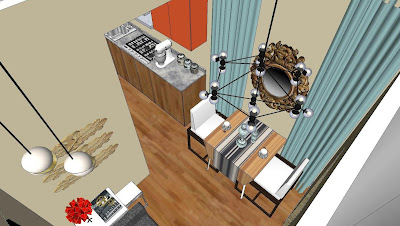
LIVING HALL AND DINING HALL. For small spaces, areas and furniture must perform multiple functions. So we opted for a two-seater sofa bed for the living hall. I added a nesting table on one end and hung a light fixture in the corner. The space is anchored by the huge art on the wall. I also put three old carved wood plaque on one wall which in lieu may be the location for a wall-mounted TV.
Right across and not far off is the dining hall. I installed light blue curtains spanning the whole height of the wall to give the room a feeling of a higher ceiling. On the wall is an ornate, antique, wood-framed mirror. I hung a modern Modo Chandelier above the drop-leaf and foldable dining table and finished off with a couple of white-upholstered chairs.
When needed, the dining chairs may be pulled near the couch for additional seating and the table folded and hidden behind the dining hall's drapery or when the sofa bed needs to be extended for the night.
BEDROOM. I placed a floor-to-room divider's height, built-in closet on one side of the room which is to have mirrored doors. Beside it, I left a narrow space for a possible small office, shoe or linen storage, or a vanity. I kept the whole color scheme muted and matched the bed linens with the trio of frameless, glass-encased gem artprints. A bed with a headboard and wall-mounted reading lamps are necessary to compensate for a nightstand.
I sincerely wish this family well. I hope they would follow some, (if not all) the design proposals that I shared here and enjoy their newly-decorated abode in the city. And I hope you've find some inspirations for your personal spaces as well.
Until next time!


No comments:
Post a Comment